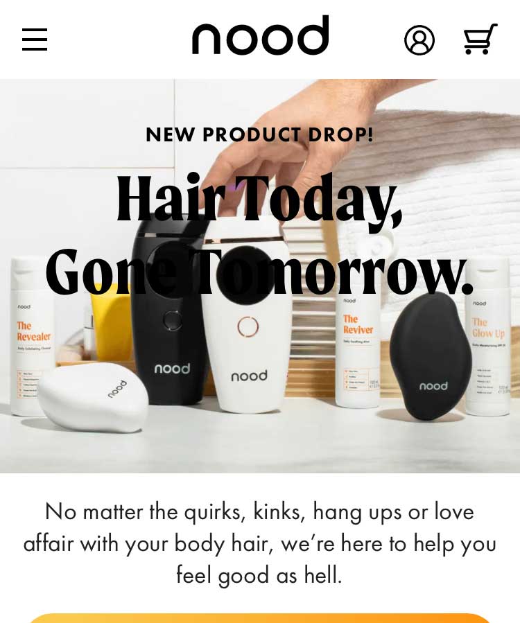
Nood's mobile homepage as captured in 2024 — dark text sitting directly over a dark product image, making the headline nearly illegible. The issue went unaddressed for years. This is the kind of problem that gets missed when no one is looking at the site the way your customers are.
Your Website Is Broken and You Don't Know It
This is going to sound harsh. It is harsh. Here's why I'm saying it anyway.
I've been in e-commerce for over 20 years — building, operating, and scaling DTC brands. Not just directing from above. In the work. So when I engage with a brand during a job search, I don't just browse their website. I take a deep dive into what's actually going on — navigation, mobile experience, checkout flow, landing pages. All of it.
Here's what I found at one well-known DTC brand.
I pulled up their site on my iPhone and the hero image on their landing page was visibly distorted — scrunched, broken, wrong.
This isn't a minor cosmetic issue. When a visitor lands on your site and the first thing they see looks broken, the reaction isn't "I wonder if this is a rendering error." It's something more instinctive and more damaging than that.
They wonder if the site is legitimate.
A broken, unprofessional-looking page doesn't just reduce trust — it triggers suspicion. In an era of fraudulent storefronts and phishing sites, a distorted hero image on a mobile device can make a real brand look like a scam. Visitors don't give you the benefit of the doubt. They close the tab.
What I Did About It
I reached out to the recruiter I had spoken with that day and flagged the issue. Then I went further — I found the right person on their marketing team via LinkedIn, connected, and sent a screenshot with a clear note: here's the problem, here's where it is, you'll want to fix this.
Nobody wrote back. Not the recruiter. Not the marketing contact. Nobody.
Here's what makes that silence worth talking about: this wasn't a new problem. The broken mobile experience had been live for years. The brand? Nood. And as of this writing, their current site hero still has dark text obscuring part of the image — as you can see in the screenshot above.
The Attribution Paradox
Around the same time, Nood was publicly discussing a month where they spent $500,000 on TikTok ads against a platform-reported ROAS of 0.5x. To their credit, their team used sophisticated multi-touch attribution tools to argue the channel was actually profitable when measured correctly — upper funnel awareness, new visitor acquisition, cross-channel influence. That's a legitimate and nuanced argument.
But here's the tension: a company with the analytical sophistication to build custom attribution models across TikTok, Meta, and Snap apparently didn't have a process for catching a broken mobile landing page over multiple years.
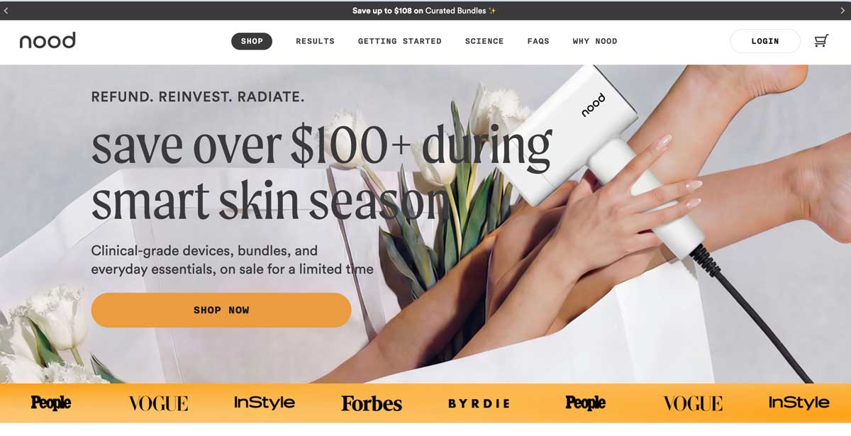
Nood's homepage as of April 2026. The site has improved — the hero is cleaner and the layout more polished. But it took years to get here, and dark text over a busy image is still present. Progress, not perfection.
You can have the most sophisticated attribution model in the industry and still be sending half a million dollars in traffic to a page that looks like a scam on the device your customers are actually using.
That's not a data problem. That's an operator problem. And it's exactly the kind of gap that experienced operators are supposed to close.
Start With Your Analytics
Pull your device breakdown in Google Analytics or your platform of choice right now. For a brand like Nood, marketing heavily on TikTok to a younger demographic, iPhones are almost certainly the dominant traffic source. That means the broken experience wasn't happening on the edges. It was happening at the center — on the device most of their customers were actually using.
Your analytics tell you exactly who is visiting and on what device. Let that data drive your QA process. If 70% of your traffic is mobile, your mobile experience deserves 70% of your attention. Most brands do it the other way around — they build for desktop and hope mobile holds together.
It usually doesn't.
Test on the Devices Your Customers Actually Use
Before any campaign goes live — before you spend a dollar — pull up your landing page on your top two or three devices. If you have a team, use tools like BrowserStack to test across hundreds of device and browser combinations. Google's Mobile-Friendly Test will flag rendering issues in seconds.
If you're a small business, keep it simple: ask your friends and family to pull up your site on their phones, tablets, and desktops. Watch what they see. Watch what they notice. You don't need an enterprise QA budget to catch a scrunched hero image. You just need someone to look.
A Quick Pre-Launch QA Checklist
- Pull up the landing page on iPhone (Safari) and Android (Chrome) before every campaign launch.
- Check your hero image — does text overlay it legibly on all screen sizes?
- Run Google's Mobile-Friendly Test on every new page before it goes live.
- Check your device breakdown in GA4 — know which devices your customers actually use.
- If you have a team, rotate QA responsibility. Fresh eyes catch what familiarity misses.
- After any site update or theme change, re-test everything. Changes break things downstream.
Operator Instinct Is Built on Mistakes
Here's the honest truth about why experienced operators catch these things: we've made them ourselves.
Early in my career I sent an email to 50,000 subscribers with the wrong price on a product. I had to scramble — adjusting the price before orders started flooding in, honoring what I could, losing significant margin in the process. A $10 price drop across that kind of volume hurts. It hurts in a way you remember.
That kind of pain builds a checklist that runs automatically. Before the campaign goes live. Before the email sends. Before you spend a dollar driving traffic somewhere. It's not a process you document. It's a reflex you earn by making expensive mistakes and deciding never to make them again.
No ATS filter scores for that. No keyword screen catches it. But it's exactly the kind of judgment that determines whether a $500,000 ad spend works or doesn't.
Have a Story Like This?
I'd love to hear it. What's the most expensive or embarrassing mistake you caught — or didn't catch — before it cost you? The best operator instincts come from exactly these moments. Drop your experience in the comments, or reach out directly.
I have more stories like this, and I'm thinking about making this a regular feature. The gap between analytical sophistication and basic operational discipline is one of the most consistent and expensive problems in e-commerce — and it doesn't get talked about enough.